Most website users hate normal fonts because they can be hard to read. 16 pixel font size is almost the exact same size as 12 point font in a book. I found it interesting that at the age of 40 your site is only half as good as it was at the age of 20. I also find it funny how most people sit with their face about 20 to 23 inches from the screen, that is really close!
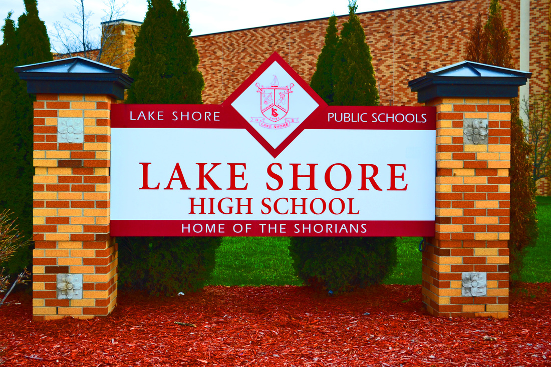 On this picture I used the sharpening tool to make it less blurry then it was. And then I used the saturation tool to brighten the picture and colors. 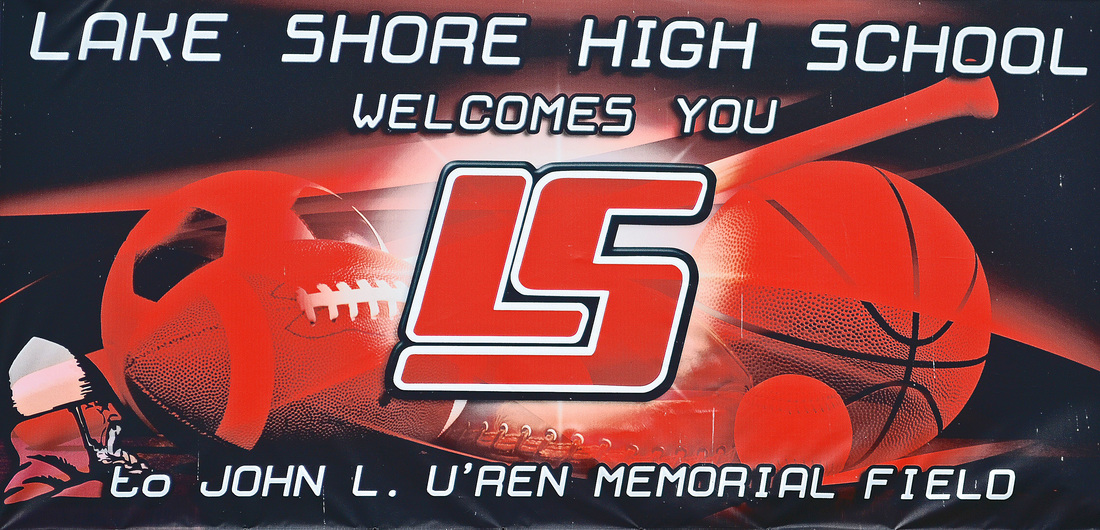 In this picture I used the crop tool to get the sign by itself, and then I used the shadow dial to darken the colors. Then I used the hue slide to bring out the red in the picture. 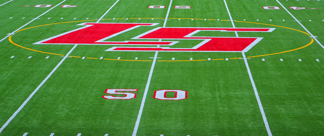 So I used the crop too again so the LS is easier to see. I used the saturation slide to brighten the colors. Then I used the hue slide to bring out the green, because it was really dark.   Although it's not working at the current moment, Payton and I want to put in a calendar so everyone knows the events happening at the school. 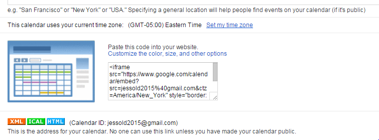 As much as I hate to admit it, Christina's website was probably my favorite out of all of them. She seemed to use a lot of skill, and although I wasn't a fan of her presentation, she still created a very unique website.
My second project was the count down. Payton and I wanted something on the screen that tied into graduation, but not something big enough to be distracting. The coding for this was so difficult because they gave you codes for two different count downs, so figuring out what to delete and what not to delete, and what to change to personalize it so it has the date that we needed on it. 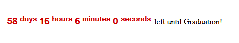 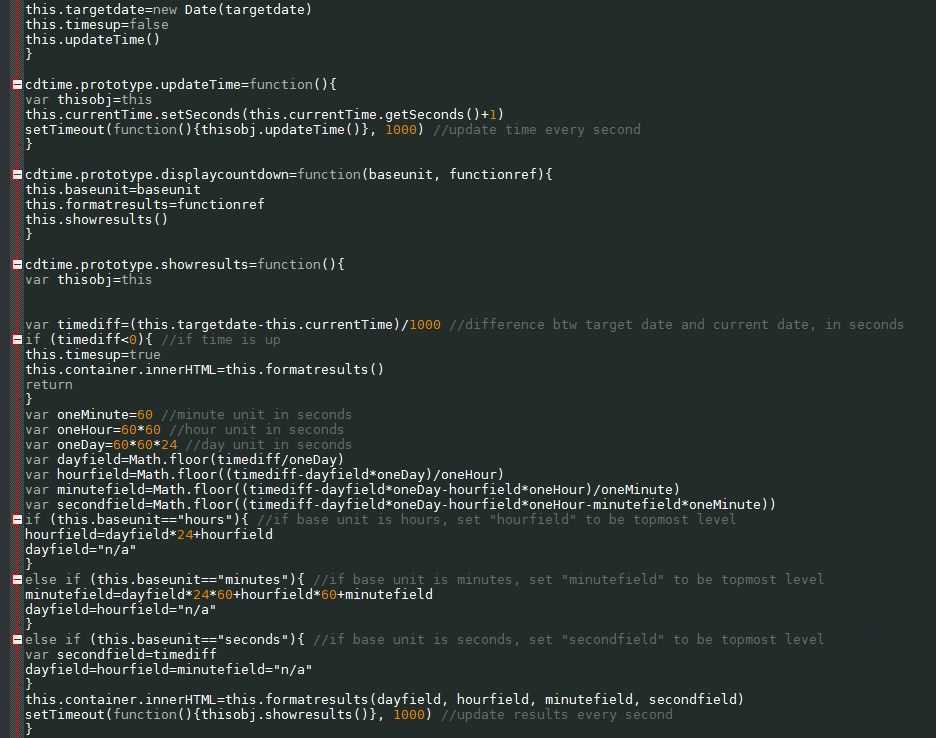 So, my first project was our navigation, which really gave me a difficult time. After going through the longer code as opposed to the code I was suppose to put in Notepad++, I figured out how to customize it, and make the colors the way I wanted them. 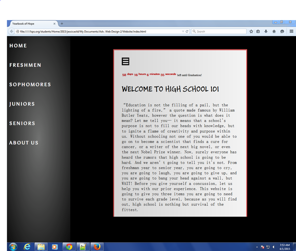 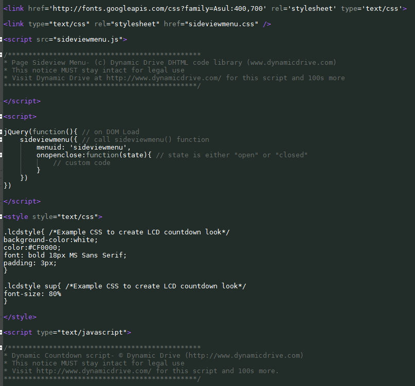 |
Jessica OldHello and welcome to my Advanced Web Design Page! Archives
May 2015
Categories |
 RSS Feed
