index1.png |
index2.png |
|
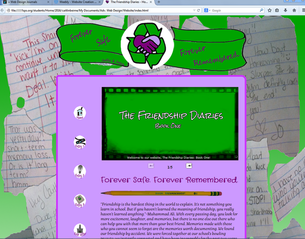
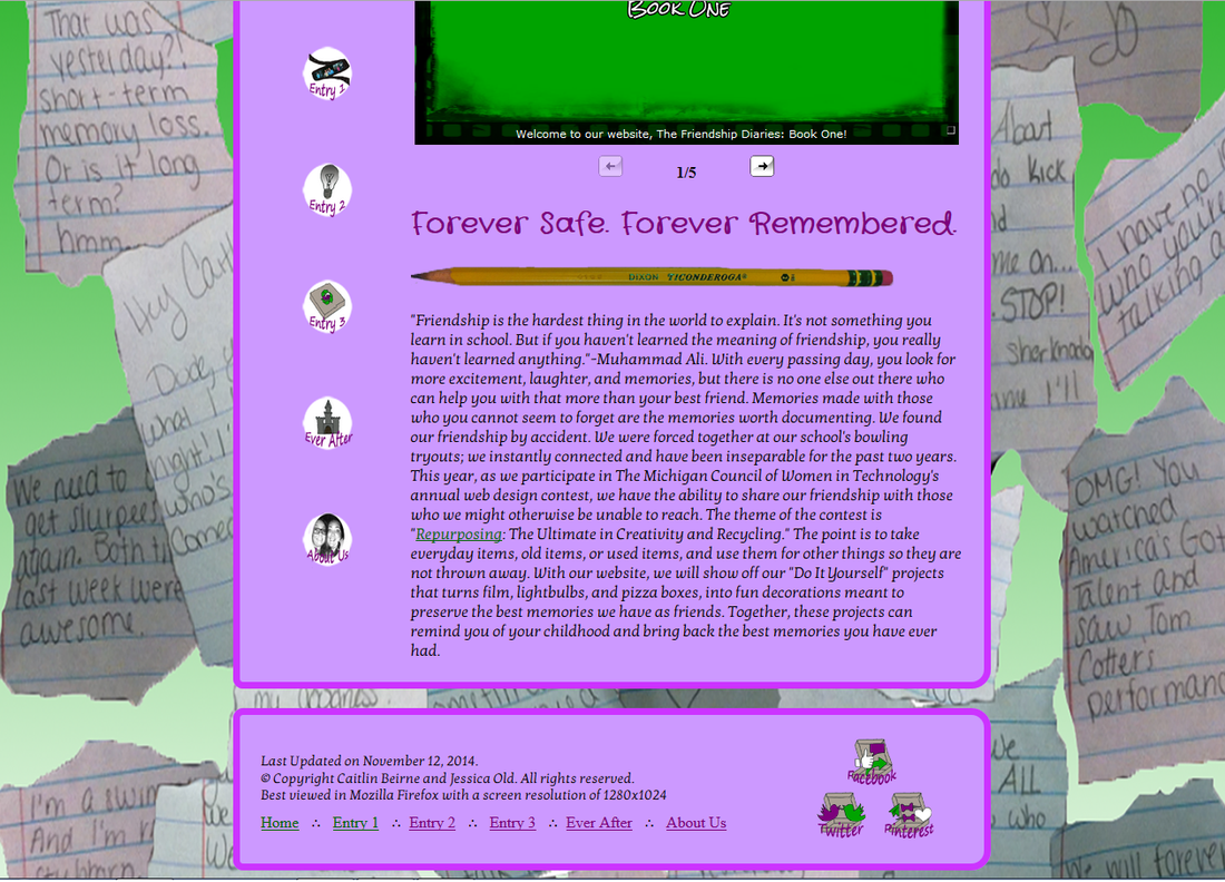
Our first page came out good, there is still some things that could use some improvement, but overall it came out the way we were planing. My favorite feature is hard to pick because there are two of them, but I would definitely have to go with the magnification on the navigation. I think its cool, different, and unique, because not many others will have it. My least favorite I think, would be our footer, its still the same as everyone else, so we are working on fixing that currently. To rate it, I would give it a solid 8, I mean its no where near perfect yet, but its getting there and I think after a little time we can pull it up to a 10.
5 Comments
Gabby L.
10/13/2014 10:20:24 pm
I really like the way your website flows and then theme is really unique! One thing I noticed was that the banner color kind of blends into the background, I don't know if you meant to do that but I think it would be cool if you reversed the color transition in the background.
Reply
Jackie
10/13/2014 10:21:22 pm
I like the overall color scheme of the website. It looks good and ties it all together nicely. If I had to change something I would probably make the navigation buttons on the side a little bigger or maybe a different shape. Your site looks really good though!
Reply
Gabby B.
10/13/2014 10:27:58 pm
This looks really good! I like the notes in the background and banner. The hands looking like a heart is a really cute idea. One thing I may suggest is to chance some of the colors. The pink and green clash a little and don't seem to tie together very well.
Reply
Hailey L.
10/15/2014 03:50:51 am
I really enjoy your website. I like the colours and I love the background. Everything is really tied together nicely. I guess, something you could do to improve would be making your navigation bigger? You're website is really awesome though!
Reply
Leave a Reply. |
Jessica OldHello and welcome to my Advanced Web Design Page! Archives
May 2015
Categories |