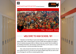
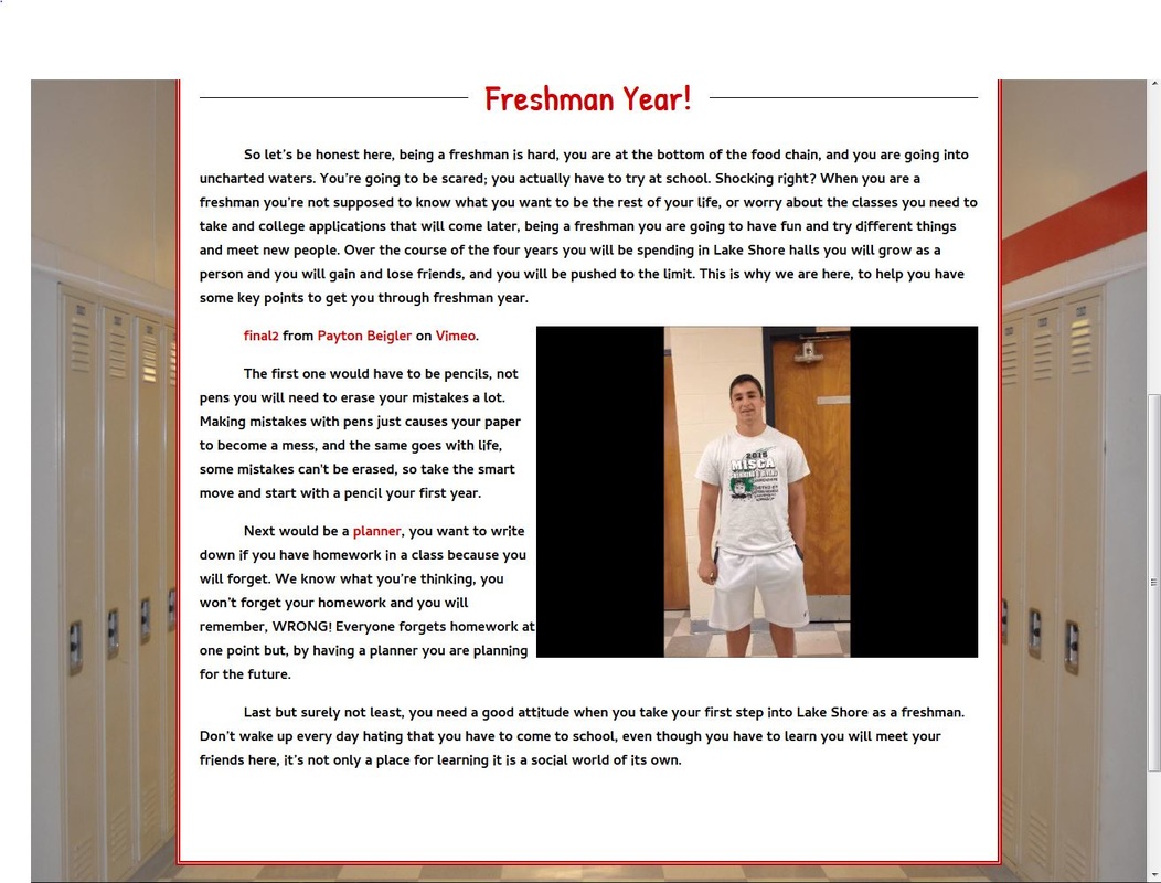
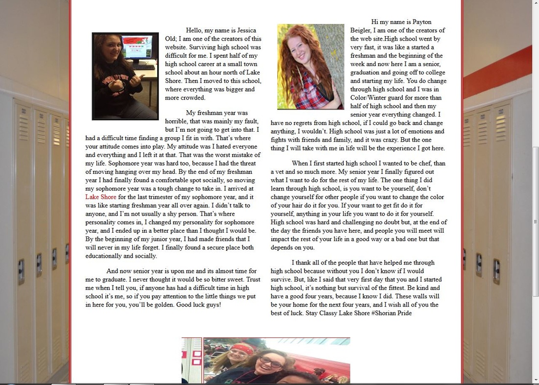
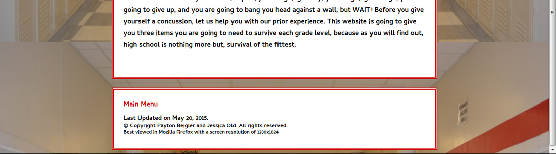
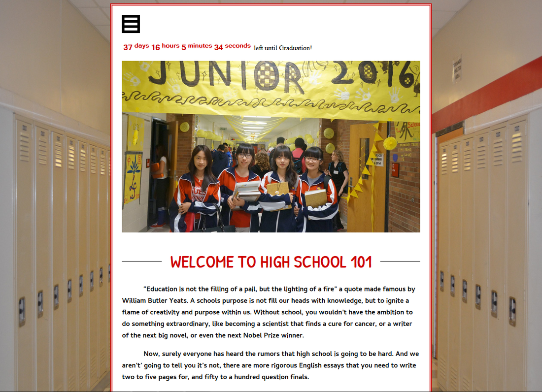
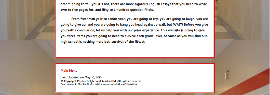
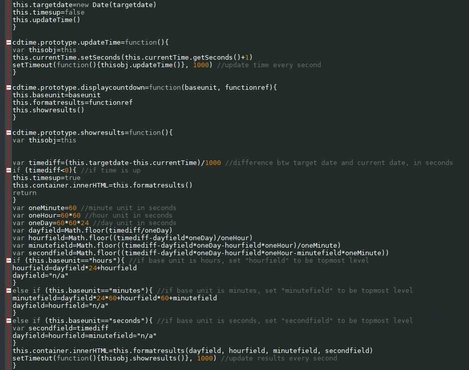
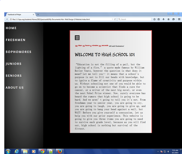
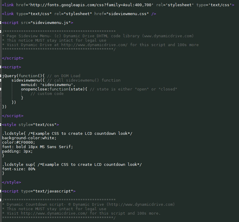
 High School 101 Introduction “Education is not the filling of a pail, but the lighting of a fire,” a quote made famous by William Butler Yeats, however the question is what does it mean? When you walk into high school you don’t know what you’re getting into. So much will change for you in the next four years, it may be good and may be bad but that is up to you. What we wanted to do is create something that we didn’t have when we first started high school, advice and tips from previous high school students. We had this idea for almost the full year we were set on putting this together, and we also thought it would be like our last word to Lake Shore and we also wanted to share some of our moments we had as well. In this class we were required to set up a website that helped high school students through each grade level, so they wouldn’t feel like there were just thrown to the wolves. We had to actually think of ideas to put on our website and we had to change certain things, and we did clash a lot. But at the end of the day we are leaving this behind for Lake Shore so when we do come back we will remember were we come from and our roots. So for this website there will be six pages, the first will be the introduction, then you will have your freshman year and through each page there will be three things that will help you through each grade level. The next pages will be the sophomores, the junior, and the seniors, the last page will be about us and how we survived high school. Index This would be our first page which is the index, one of the hardest pages to do on the website because it is the outline. We played with some ideas, try to make it like a yearbook and use the actual pictures, but when we ended up doing is taking a picture of the lockers like the viewer is standing in the hallway of Lake Shore. The overall purpose of the website would have to be the survival of high school and what we did to get through all of the drama and the classes. We wanted to keep very close to the hallway itself so we took a picture of the clock on the wall and put it right in the table so it looked like it was against the wall. We also wanted a drop down for the navigation and we also wanted something different, we wanted to be unique. So Jess found a really amazing drop down navigation on dynamic drive and she played with the code and it was up the site. I drew the favicon and I used a sailboat because Lake Shore is in the shores so I wanted to play off of that. The social media we used the LSHS Shorian sites and then we ended up making a Pinterest called High School 101. The next page of the website would be freshman year, oh the fun. Freshmen Page The craziness of freshman year, it is filled with new classes, students and teachers. You are also in a new environment and everything is brand new. You do get lost a lot freshman year because you don’t know where everything is but you will get the flow in like a month or two. Building this page was still difficult because we had to think back four years ago thinking what we needed to make that year go a little smoother and easier. When we finally figured it out we hit the ground running, and we just started putting different this into the website like all the tips that we wanted to give to people. So when writing advice we had to try to keep it generic, which was our toughest struggle when creating our video, which can be found on the freshman page. Every page had to be generic, because every piece of advice needed to address all types of people. We tried to make it so that we gave advice that we wish we would have gotten as freshman. Sophomore Page Our page for the sophomore class was a page where we wanted to make sure the new sophomores knew what was going on. Sophomore year is a very weird year, it’s the year where you’re no longer the lowest on the food chain, but you’re not the highest either. So socially you’re at an awkward spot. Then there are the academic challenges you face, with the curriculum being more difficult than last year. We just wanted to make sure our page gave them some advice on how to make sure that this year is as awkward for them as it was for us. Our favorite code would have to be the navigation at the top of our pages. Only because it was the most challenging and we love a challenge. The difficulty was in the fact that it came with a whole code document in itself. It wasn’t just a “copy this code and throw it in the body” type of navigation. The most fun part about it though was trying to figure out what each part of the code meant, so we could modify it to match our color scheme and our overall website. Junior Page The page for the juniors was difficult to say the least. How do you tell someone that they are almost done but you still have two years to get through? We tried to emphasize that these two years were going to fly by faster than they expected. The three things that we suggested they use to get by the year were three things we wish someone would have told us about. Maybe if they would have then junior year wouldn’t have been so difficult. Our biggest ah-ha moment would have to be when we figured out where to put our social media guy. He needs to be a certain size in order for him to look right. The size that he needed to be wouldn’t fit right in our footer, so that option was out. We tried to put him outside of our table, at the top, but it shifted our table to the left. That just looked strange. So Jessica sat in front of the computer screen for a good ten minutes before she had the idea that maybe she can put it in the navigation table. We didn’t actually think it was going to work but she tried it, and to our surprise it actually did! It was a huge accomplishment, and we were very excited about it. Senior Page Our senior year page was honestly the easiest out of all the pages. Surviving senior year is fresh in our minds considering we are just now getting out of it. Sometimes giving advice to people can be difficult because no one person takes advice the same way. If I were to tell you that senior year is a very emotional time, then you would take that differently than if we were to tell a guy that. So trying to find something to say was difficult to say the least. However, our page came together quite well, and we whipped it out like it was nothing. My favorite Photoshop edit would have to be the social media, because it turned out very good, it took me four days to do it and to make sure that everything was perfect. What I learned was to be patient with Photoshop and take your time because if you rush than you have to redo the entire thing over again, patience is key. About Us The last page we had was our About Us page. It is mainly just a page that tells people about who we are and how we survived high school. Payton and I are two different people. The way we survived high school were two completely separate things. So trying to give advice to people on how to do it was challenging. We had a lot of disagreements, which is why the NET Communication would have to be the most important one that we met. It was hard working with someone who has a whole new view on the subject than you do. It is also difficult to work with someone as hard headed and opinionate as you are. So working through our differences to get this website done is a achievement in itself. The rest of the NETs however, were also met. We definitely used creativity in our website. It is hard to make a website unique when its already being based off of a school, which already has its own color theme, its own mascot, its own logo, and its own catch phrase. There was a boat load of problem solving while making this website. The codes that we used to create some of the things in it, such as our countdown, took a ton of time to figure out, and it took thought and energy, but it got done. Conclusion Web design has become our favorite class. The coding, and the creativity, and the problem solving, makes this class both challenging and entertaining at the same time. We don’t think we would change anything about our website. In the amount of time that we had to do it, it came out better than we were expecting. Jessica’s strength would probably have to be teamwork. She has a way of dividing up tasks so we both had something to do, and we were both getting things done that needed to be done. Payton’s strength would have to be her dedication, she is a perfectionist. In this type of class that is not a bad thing. She makes sure that what needs to get done, gets done, and it gets done to the best of her ability. However that’s also her biggest weakness, she wants to make sure everything is perfect, so she checks in with anyone she can to get feedback, instead of saying “Okay, I like this, I think it’s good, I’m leaving it like this.” Jessica’s biggest weakness is time management. She sits a chats instead of just getting done what she needs to get done. This experience has given us the chance to improve our communication and our problem solving skills. Payton is planning on going into this field so it gives her a huge leg up. As for Jess, she may not be needing it later, but just the experience in itself is a memory that will last a lifetime. 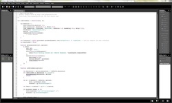 Our favorite coding photo. |
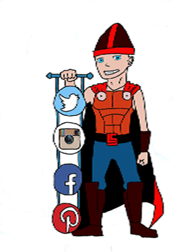
Our favorite photoshop photo.
| essay.docx |

 RSS Feed
